Sunday 29 July 2012

And now for something completely different.....

and it's nothing to do with Monty Python, it's the latest page in the 'Turn It Up' journal, and there's not a single electric guitar in site. It is, however, loud; Very, loud!


This page is inspired by the "Dies Irae" from Verdi's "Messa de Requiem" (Requiem Mass). The Dies Irae (or Day of wrath) is based on the Day of Judgement, and it's possibly one of the most powerful and stirring pieces of music ever written.

You'll want to turn this one up; but don't blame me if you have to buy new speakers!

Friday 27 July 2012

Zombie!


This is my latest page for the "Turn it up swap" journal. However, this is nothing to do with shambling, brain-eating undead. It's a song about the futility of violence, a 1994 protest song by The Cranberries, based on the troubles in Northern Ireland, but particularly the Warrington bomb attacks which resulted in the death of two young boys.


Monday 23 July 2012

Exhibits, Part II

I hope you haven't been waiting too anxiously for these, I managed to get distracted again.

First up, summer swifts. This was originally intended as the background for a steampunked dragonfly to got with the butterfly & moth, but it didn't work, so I inked in a few swifts for a nice simple summery canvas.


Next up some recycled art. This was originally a workshop piece. It's watered down acrylic sponged onto some basic cardstock. The stone....  yes, it's a stone. No, I know you thought it was something else,  stop sniggering. As I was saying; the stone is acrylic with salt texture, and it's all mounted on a  piece of scrap cardboard from a packing box.


Last, but not least, a pencil sketch inspired by one of the exercises on Lisa Wright's course.


Tuesday 17 July 2012

Nova Lepidoptera

Time to start showcasing some of my creations from the Cubby Hole's Diversity exhibition, and I'll start with my favourite piece which was my contribution to the Steampunk theme.

We were required to create something that was 12x12 so that it would be easier to combine them all. My original idea was a copper-plated contraption with buttons, bells and whistles, but somewhere along the line I finished up with a butterfly.

The main part is grungepaper covered with tissue and painted to give texture. The contrasting colour was then cut out to reveal the 'workings'. These are copper sheet that's been put through an embossing machine. The background is a 12x12 canvas; painted with acrylics and distressed. The copper patches are embossing paste and brads.


The title is from Barclay James Harvest.

I've also created a Cinnabar Moth in the same style, but I'm not as pleased with it as the butterfly, and didn't have the same buzz when I was working on it.


Monday 16 July 2012

Celebrating the Diversity 2

On Friday we had the preview evening of the latest exhibition at the Cubby Hole. "Celebrating the Diversity" is all about the community of artists & crafters who's creative home is the Cubby Hole. There's a whole range of creative types; fine arts, mixed media, stitchers, beaders and many more. It's a place where people come to socialise, create and learn. We swap ideas, teach techniques and eat cake.

The diversity exhibitions have a focal point which each person contributes a piece to, and this years focus was Steampunk, requiring us to create a 12x12 piece.

This is what we came up with...

 This is another wall full of art

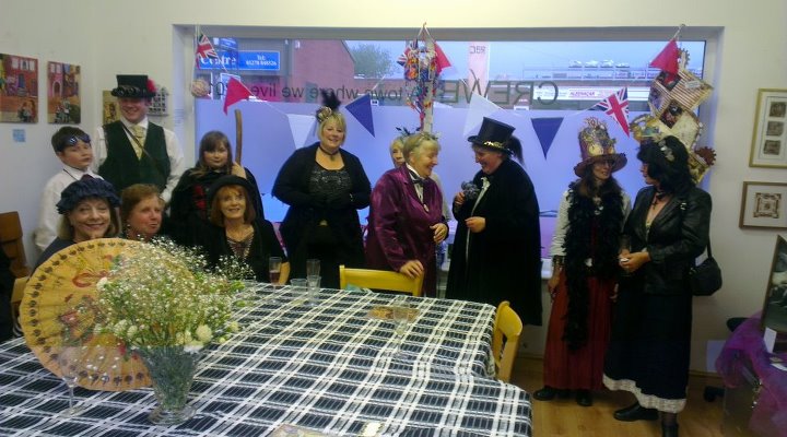
And these are some of the wonderful people that created it

I'll be posting my work over the next few days, but for now keep an eye on the Cubby Hole blog, as there's bound to be plenty of pics on there.

You'll also find some more of us in blogland
Palma 
Sue Roddis
Suzanne
Suzi B
Wendy 

Tuesday 3 July 2012

Siân & Nigel Journal Swap - The reply

If you want to see what I'm replying to, have a look here.

When I found out the title of Siân's journal I knew immediately what my first entry would be. It's a loud, gritty, in-yer-face kind of song that I was introduced to by my youngest.


The backgrounds are black acrylic, scrubbed on roughly and then over-sprayed with suitably dark inks. Lettering is white gel pen. It was all very rough and ready, which fits perfectly.

The inspiration is below. Warning: Not suitable for those of a nervous disposition!  :)